back in 2018, a girl i was hanging out with a lot asked if i wanted to go to a free event at the portland art museum about the “design and philosophy of MUJI”, delivered on the occasion of the opening of a MUJI store in portland. i had no idea what MUJI was and her explanations weren’t very helpful, she showed me some stationery on her desk and an interior design instagram account showcasing the “MUJI house”, but i immediately agreed to go because i had a crush on her. little did i know at the time that my relationship with MUJI would end up lasting much, much longer. in fact, by the time the event finally rolled around, it was quite clear that nothing was going to happen and that she had probably just been angling for a free ride to the event (evidence: in the intervening period i managed to successfully set one of my friends up with her).
since i had completely given up courting her, it felt like a weight had been lifted, there was absolutely nothing riding on what would have otherwise been a critical opportunity to spend several hours alone together on something that could easily be construed as a date. i was completely free to be myself and devote all my energies to enjoying the event (whatever it was), without constantly worrying about saying the wrong thing or making the wrong move and ruining my “chances”. we chatted while driving and waiting in line outside, which less than a month ago would have almost certainly been a tense and nerve-wracking experience, but instead i felt completely at ease, nothing i said mattered anymore. when they let us in, i grabbed a free bottled water on the way to sit down in the auditorium, feeling amused because nobody knew that i was secretly crashing the party by taking a place among the audience for such an event while not even knowing what MUJI was. there were a fair amount of people there, maybe fifty to a hundred or so, though there was still plenty of space left in the auditorium.
improbably, the presentation was given by MUJI’s biggest cheese himself, ryohin keikaku KK (MUJI's parent company) chairman and representative director masaaki kanai. he had a long severe face, the kind of face japanese men of power seem to acquire after several decades, as if their face shoulders the weight of responsibility. he was wearing an austere black yohji-yamamotoesque long shirt that was practically a robe, which gave him a modern but vaguely monkish aura. why did he deign to grace portland with his presence? why was muji even opening a store in portland? at the time muji had only 9 US locations, one in boston and the rest in new york city. there had been a handful in california too, but all of them had closed years ago. my personal theory is that it’s due to the mysterious japanese fascination with portland, over the years i’ve discovered several books in japanese written about various aspects of portland, presumably there are enough portland otaku out there to support sales. i’ve also heard that there is a portland-themed bar in shibuya called “the pdx taproom”, and i'm sure nobody’s scrambling to open a “columbus taproom” or “seattle taproom” in shibuya, even though seattle is the tokyo of the US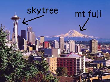 .
.
i quickly gathered from the introduction that MUJI was some kind of japanese brand that designed and sold its products in a large chain of its own stores. but there had to be something more to it too, because not just any brand gets to come in to the portland museum of art and get free promotion by doing a presentation on its design and philosophy. then, kanai-sensei stepped up to begin the presentation (through a translator), and i was enlightened.
he began with the core of the MUJI philosophy, partially captured within its full name MUJIRUSHI RYOHIN (無印良品), meaning “quality unbranded goods”. besides their name, another focus was on lowering prices and reducing waste, expressed within the minimalism of their packaging and product design. there wasn’t anything particularly astonishing so far, every hip brand has been pushing minimalism and eco-consciousness lately, but then kanai started discussing their vision for the ideal MUJI customer experience. the intended reaction from the customer upon seeing or purchasing a MUJI product, he said, is not “This is what I really want”, but rather “This will do” or “This is sufficient” (i believe in japanese he said これでいい). the aim, essentially, is to sell the “minimum viable product”. from that perspective alone, most of the MUJI aesthetic can be derived: simplicity, minimalism almost to the point of mundanity, subdued colors. reducing waste and cost come as a natural consequence of reduction to the bare essentials. the remainder is covered by the name: no logos or branding, and quality from design and careful selection of materials.
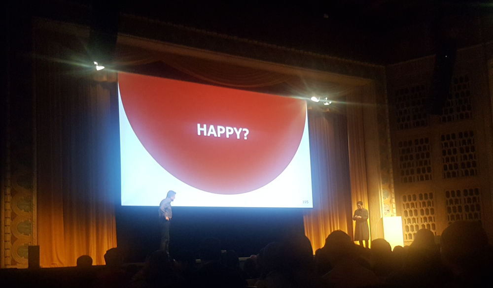
i could hardly believe what i was hearing, my mind was absolutely blown. in america, where the customer is king, where satisfaction is always guaranteed, where even the cheapest trash is still labelled “premium”, “select”, or “choice”, these things he was saying were radical, almost blasphemy, unimaginable heresies for a retailer to say out loud. every product for sale in america promises to be exactly what you want, exactly what you need, exactly what will satisfy your every desire and fulfill your wildest dreams, the only path to happiness is purchasing. everybody knows it’s all bullshit empty marketing but quietly they still expect companies to keep up the kayfabe and punish ones that don't, so companies dutifully continue. you don’t just go up on stage and say “our product is not the best, it’s merely good enough”, it’s completely unheard of. but here was this crazy japanese guy up on stage who not only said it, but explicitly identified it as a key aspect of his company’s design philosophy.
after only ten minutes, i felt that i had a fairly good grasp on the design and philosophy of MUJI, which is what i've written above. but as the presentation continued, it slowly dawned on me that perhaps i actually understand nothing at all about the design and philosophy of MUJI and possibly nobody did or ever would. before i knew what was happening or how we’d gotten to that point, kanai was discussing some kind of MUJI-led initiative that involved bring a bunch of city slickers out to a remote depopulated mountain village and reviving it for a bit, teaching them how to farm rice and stuff.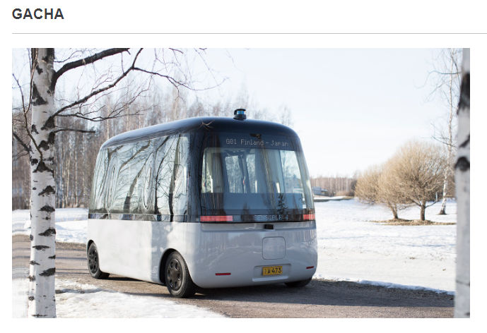 i discovered proof that i didn't just hallucinate the bus thing this was not some kind of hypothetical or reality show pitch, this was something that they actually did and it was thoroughly documented with several slides of pictures. then there was the project where they designed some kind of heavy-duty automated bus to take children in rural finland to school in perilous winter conditions, which was so out there that it made the village thing seem reasonable by comparison. there were more but those are the two that were so outrageous i still remember them six years later.
by slide 100, the presentation finally reached the big questions and "deep" topics. really, it was silly of me earlier to think MUJI would limit their philosophy to the design of everyday objects and living spaces, in fact it seems that MUJI aims to take on capitalism itself. this is when i began to take pictures of a few slides, starting with this one:
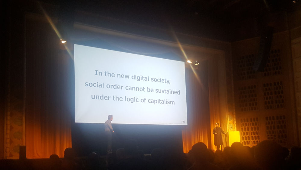
i didn't think anything could top the "this will do" bit from earlier, but here it was, the CEO of a multinational corporation talking about ending capitalism. i felt a bit of whiplash recalling an earlier slide with the corporate profile of MUJI's parent RYOHIN KEIKAKU CO., LTD., boasting of their capital, annual turnover, number of employees, number of locations, etc.if you’ve ever seen a japanese corporate website, they all have a page like that, here’s an example . also, in the bottom right corner of every slide there was a little watermark that said “Copyright ©2018 RYOHIN KEIKAKU CO., LTD. All Rights Reserved.” that wasn’t the only contradiction with MUJI, i noticed. although MUJIRUSHI means unbranded, the dark red all-caps MUJI has become something of an iconic logo/brand in its own right, though they have not yet sold out completely and put it on their t-shirts or clothingmaking your own shirt with the MUJI logo would be a great niche joke, only tote bags. however, the name of every weird side project inevitably includes MUJI, i swear i once even saw something they called MUJI MUJI.
at some point maybe 30 minutes in, the girl i was there with began making physical and verbal gestures expressing that she was getting tired of it and wanted leave early to hit the actual newly-opened MUJI store nearby. however, by that point i was so enraptured by the presentation that i insisted we stay as long as possible, yet again something i would not have dared to suggest even a month ago. in fact i was almost taken aback, like i drove her all the way to see this presentation she wanted to see on a topic i hadn’t the faintest clue about and now SHE was the one who wanted to leave early, even though the presentation ended up being so unexpectedly fascinating. but, i did have to concede that i was curious what the actual storefront looked like, so i convinced her to let us stay as long as we could while still being able to make it to the MUJI store before it closed at 9 pm. we ended up leaving shortly after kanai started laying out the MUJI vision for the post-capitalist “pleasant society”.

after hearing so much about what MUJI was supposed to be, it was time to finally see what MUJI was. would the storefront turn out to be the "true" form of MUJI, or merely the shadow cast in the physical world by something much larger? on the ground floor of a historic department store building located downtown by pioneer square, it looked to me like literally just a store, a chic japanese retailer selling its own distinctive minimalist line of clothing and home goods. it was like a rustic uniqlo that sold unbranded clothing made of quirky materials with interesting textures like hemp or “kapok” (?), combined with a restrained miniature japanese ikeaalthough MUJI doesn't come close to the overwhelming size of ikea, they've managed to outdo ikea in at least one domain, by releasing furniture made of actual cardboard. the interior was cozy, almost every surface was some shade of dark wood. MUJI loves to pay tribute to “local design”, which in oregon naturally means wood if it were up to me, the only legal architecture style in the pacific northwest would be the heavily-wooded “rustic cascadian neovernacular”, a wonderful term i discovered because it was listed authoritatively in a wikipedia infobox as the purported architectural style of mt. hood’s timberline lodge. i suspect some pseudonymous wikipedia editor coined the term out of whole cloth because the handful of search results i found online for it all seemed to be blog posts and lazy news articles about timberline lodge “researched” using that wikipedia page, whether they admitted it or not. now this page takes its place among them, i wonder how many more times i have to write “rustic cascadian neovernacular” before this page is one of the top results. rustic cascadian neovernacular. rustic cascadian neovernacular.. the other décor and design accents within the store were wood, too, various interesting pieces of “reclaimed wood” still bearing scars and patina from their prior working lives, before they took up modeling. right when everything seemed to be coming together and making sense, i noticed that in the geographic center of the store there was a little coffee stand with a robot barista, by which i mean a miniature version of one of those robotic arms you might find in the toyota factory taking jobs from honest autoworkers.
although i would eventually come to appreciate it, at the time i could not stand anything to do with clothes shopping, so with the limited time remaining until the store closed for the night i drifted over towards MUJI’s substantial stationery department. the MUJI desk organization system is unified around a single material, this slightly-cloudy transparent polypropylene plastic that now probably makes up 30% of the microplastics in my body and makes up everything from pencil boxes to folders to the MUJI gel ink ballpoint pen. of the MUJI gel ink ballpoint pen, i will only say that i’ve now owned at least 50 of them, and it was one of the five items included when i tried to come up with a list of products i wholeheartedly endorse (four of them were japanese and three were drinks). other highlights include the tiny folding stapler that’s small enough to take around in a pencil box, or the cute little scissors that collapse into a form that vaguely resembles a shiv and that i have never taken with me on the plane because i’m almost positive airport security would confiscate them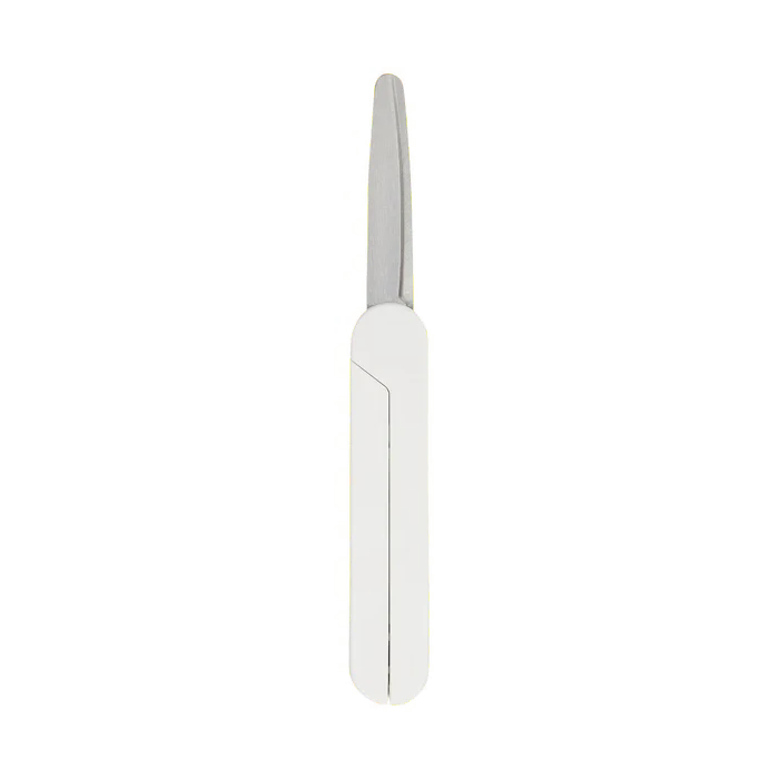 . there’s also a handful of quirky niche items with interesting designs, like the portable shredder with a handcrank or the “stapleless stapler”, a plastic gizmo that can loosely bind together up to five pages, to which my mom reacted “what the heck is this” after i handed it to her when she asked for a stapler.
near the stationery section, there was an area with a selection of stamps for public usage, ideally in your newly-purchased MUJI notebook. another use for them was stamping a MUJI logo, if you chose to, onto the plain brown paper shopping bags you get at checkout (this is one area in which MUJI has sold out a bit, because the shopping bags now bear a prominent MUJI logo). there were many generic stamps but i spotted one portland-exclusive stamp, which i stamped into the (non-MUJI) notebook i was carrying around at the time:
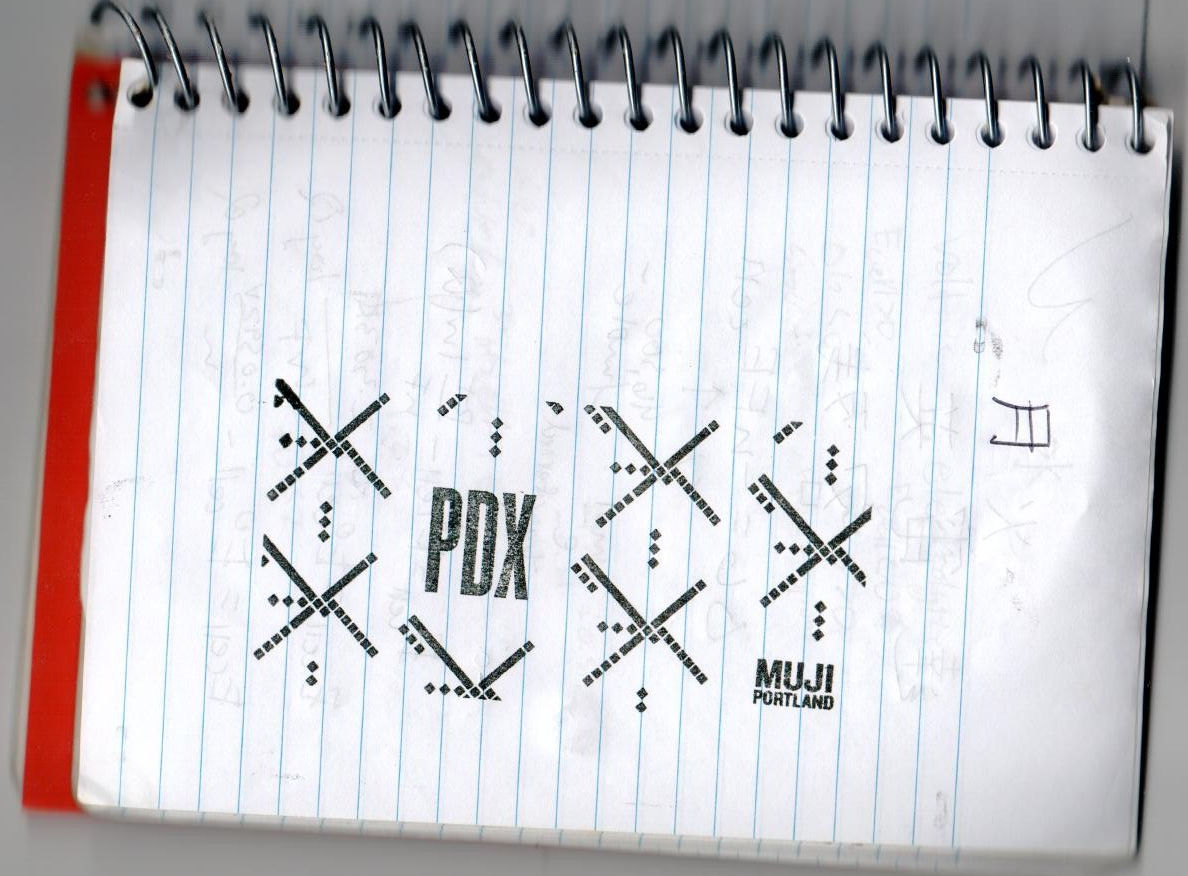
the design is, of course, the beloved old portland international airport (PDX) carpet pattern that nobody appreciated until they removed it. it’s notable enough that it even has its own wikipedia page, an honor i doubt any other airport carpet has received. for the past couple of years the airport underwent a massive annoying renovation that was supposed to be entirely worth it because they promised to reintroduce the old carpet like some kind of endangered species. i happened to fly out of pdx last month just a day or two after they opened the new terminal and i have to admit the aggressively eighties/nineties design and almost garish color scheme of the old carpet clashes pretty strongly with the sleek modern design and tasteful colors of newly-renovated terminal, which like MUJI takes inspiration from local design (wood, and also there's actual trees). it would still fit in fine in the unrenovated parts of the airport, its natural habitat, where of course they do not plan on reintroducing it. the stamp with the carpet design also disappeared from portland MUJI at some point...
unfortunately, we couldn't linger long because the store was about to close for the night, so i purchased a few token stationery items (they felt like the best value) and we headed out. on the way back she wanted to nap in the car and asked me to turn down the music but i insisted that i could not stay awake for the drive unless i was loudly singing along to the bakemonogatari soundtrack. admittedly i was going a bit overboard but i was convinced that this kind of "not giving a shit" behavior would help me make a clean break and get over her fast (spoiler: i did not). perhaps after how much i've emphasized it throughout, you might have thought that my new attitude ended up getting me the girl somehow - "i love how assertive you've become" - but as it turns out, she's not the subject of this particular love story.
since that day, my fascination with MUJI has continued, perhaps driven by a desire to finally figure out the design and philosophy of MUJI. i've made up for my abortive first visit by going back to portland MUJI on many occasions, where a typical visit involves spending at least an hour carefully inspecting every single product in the store before purchasing three items for no more than $20. i've also visited several locations in japan, including the ginza flagship that even has a MUJI hotel, and the largest MUJI in europe, which has a small museum/exhibit space (where i entered a raffle to win a tiny european pallet), restaurant, book store, and "local market". occasionally i fantasize about moving to japan and furnishing an entire tiny efficiency apartment with MUJI goods, it feels less "basic" than ikea (but who knows, maybe in japan MUJI is seen as basic), and you don't have to support ikea's shady swedish scheming.
have i learned anything more about the design and philosophy of MUJI over my last six years of "research"? i don't think i've gotten any closer to articulating exactly what it is, but it certainly feels like there's something there. a lot of companies pay lip service to some vague feel-good "corporate philosophy", in america usually something to do with producing the best products that guarantee absolute customer satisfaction, but MUJI feels like the rare company that's actually partially driven by something other than making money. many of MUJI's wacky side projects do not seem likely to make any sort of profit from the outset, and yet you can't really call most of them charity either. i cannot deny, though, that everything MUJI does has a distinct MUJI vibe, which hints at the existence of some common underlying element, an elusive essential "MUJIness"...