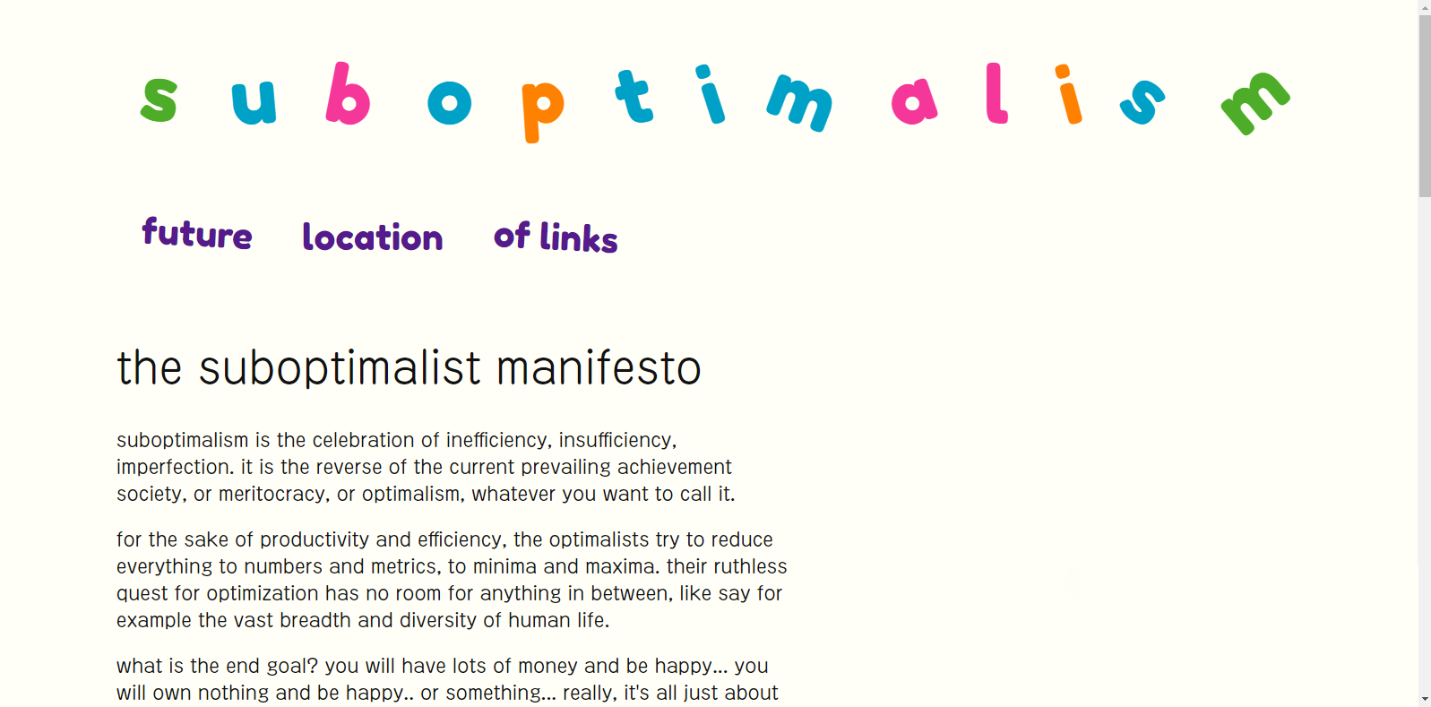
i glanced at my profile page the other day and noticed that as of this monthIT IS STILL MAY IN MY TIMEZONE!!!, this site is officially two years old, so why not commemorate the occasion by reflecting a bit on its development. i’ve mostly avoided the topic over the years (now i can finally use the “s”) to preserve the mystique because there’s already way too many sites out there discussing web development and their own design. that kind of circularity is one of the cultural trends i’m most concerned about, when things turn onto themselves so deeply that they become completely disconnected from everything else. what’s the point of blogging if all you blog about is blogging, or having a website if all you talk about is having a website? however, i think most will agree that i’ve put out a more-than-sufficient quantity of non-meta writing on this site, so i’ll allow myself to indulge.
the monolithic css design philosophy
“wow,” some people say, “your website has dozens of pages using the same slick theme, what static site generator do you use?” well, my “static site generator” is copy-pasting a couple of basic page templates and using the same css file for every page on the site. you can verify this yourself, inspect any page on this site and you'll see at the top they all link to the stylesheet located at suboptimalism.neocities.org/style.css, now rapidly approaching one thousand lines. how did things get to this point? well, it’s the grotesque final outgrowth of a development process fertilized early on by a few half-remembered dubious css “best practices” i picked up from some classes and who knows where, then for some reason followed like the gospel in the absence of any alternative guidance. over time i’ve realized that none of that stuff is really relevant for people messing around with personal sites, you can just do whatever and if it works, it works. the great thing about working on a solo project is that behind the scenes you can do whatever inconvenient esoteric unmaintainable stuff you want as long as you’re willing to put up with, since you’re only inconveniencing yourself.
probably the most influential css commandmant i obeyed was “thou shalt NEVER use inline css or css embedded into a page using the style tag”, which for a while i followed quite faithfully. all css had to be in an external file, but before long i started wondering what the point was. it felt like i was just cluttering my directories for no reason, turning each page into an html file and associated stylesheet when they could easily be just a single file. plus, most of my pages were pretty similar, so it felt like i was just copying and pasting the same stylesheet over and over for each page. it unsettled me a bit, because that meant i was violating a more fundamental coding principle: DRY (Don’t Repeat Yourself). then i realized, aha!, obviously the point of external css is so lazy people like me could reuse the same styles for multiple pages by linking them all to the same css file! taking this to its logical extreme, if i want my whole site to have a consistent theme, why not use just one css file for every page? thus began the long and fruitful reign of the mega-css file.
there are benefits and drawbacks to the monolithic css file design philosophy (big surprise). it’s easy to make styling changes that instantly apply themselves to every page, like when i changed the whole site to the “dork mode” color scheme. i’m fairly consistent with html on my pages so it should be theoretically possible to completely overhaul the site’s aesthetic only making changes to that one css file (though there was that one time where i had no choice but to go through ~20 pages in the writings folder adding a couple divs).
 some web nostalgia for the og's, the very first version of the site. for the first few months i had no idea that beige background snuck in somehow, on my laptop's janky bright screen it appeared white. i've kind of taken that color and ran with it, though. also, i put that out during the heyday of yesterweb, and i remember being annoyed how they briefly ruined the word "manifesto" around here (if you were around, you know what i mean)one issue i’ve had is that although there are universal styles in the sheet used on every page, it’s starting to get clogged up with a bunch of one-off css rules that are used for only one or two pages. they can’t really go anywhere else while continuing to respect both the “only one css file” and “no inline/embedded css” regimes. as a resuly, now my css file “...can be seen as an ancient city: a maze of little streets and squares, of old and new houses, and of houses with additions from various periods; and this surrounded by a multitude of new boroughs with straight regular streets and uniform houses.” i’m lazy so i do try to reuse rules when i can, but that often leads to new problems: i’ll forget which pages they’re applied to, make some change intended only for one of those pages, and accidentally break all the others. if i had to start over i’d probably ignore both commandmants and take the middle way like so: keep just a few of the truly universal css rules in the main file and split it off into a few different stylesheets for heavily-used formats like blog posts, and then embed all the one-off rules in their pages. i guess there’s nothing stopping me from doing all that “refactoring” now but what’s the point, as i said before, the only one i’m inconveniencing is myself. let’s shoot for 2000 lines of css in one file next and see how much the neocities editor can handle.
the mega-css file didn't start from nothing, though. i find it difficult to code anything from scratch, all the blank space intimidates me and i never know how to start. i prefer to start with something that’s already more or less done, and modify it for my own uses until it becomes unrecognizable. there are plenty of premade stylesheets out there to use as a base, but which one to choose? luckily, i started with an essential requirement that easily narrowed it down: i really wanted sidenotes. i love tangents and asides, however i’ve always found the positioning of footnotes and endnotes inconvenient, too far outside the flow of the text. sidenotes are perfect, though unfortunately they require too much horizontal space to be practical in most print formats. space isn’t an issue on websites, but how do you even do proper numbered sidenotes in html/css? i’m far from the first to encounter this issue, so there’s plenty of hacky-but-functional implementations (history of css in a nutshell, more or less) people have cooked up over the years.
eventually, i settled on a simple, tasteful solution, a css template called “tufte-css”. it’s based on the signature book design/typographical style of a certain edward tufteafter only hearing about tufte because of this css thing, i discovered one of his books in the house a couple months ago and it was like seeing a ghost when i opened it up and saw the layout. my brother must have bought it at some point, which is odd because it seems far removed from his favored genres (conspiracies, gourmet cookbooks, obscure photobooks). tufte's a fascinating guy, with a career that's difficult to summarize. his current project seems to be building a sculpture park in rural connecticut., who has written several extra-wide books on data visualization replete with sidenotes. i haven’t the slightest clue how it works but it involves copy-pasting a couple of complicated html tags and then writing the sidenote itself within a span. it was even able to handle a sidenote-within-a-sidenote, which i of course tried to deploy in the very first page i made. not sure if all of it is totally necessary however at this point i’m fully dedicated to cargo-culting the whole thing around for every sidenote, which has gotten annoying enough that i probably don’t use sidenotes nearly as much as i should and instead expose readers to excess parentheticals. maybe in html6 they’ll finally add an html sidenote tag and make my life easier (the aside tag already exists but it’s only good for margin notes because it doesn’t have numbering).
oh no, javascript! RUN!!!
the one thing i know about javascript is i should try to avoid it because everyone seems to hate it for reasons that have never been made clear to me. maybe it’s because it makes sites incompatible with the DSi browser or something, i don’t know. it’s possible at this point that the origin of the javascript hate has been lost to history and people only hate it because everyone always has. i made a good-faith attempt to avoid it, but in the end there are certain types of dynamic content/laziness that are simply impractical to implement without it. the biggest example on my site is the header at the top of almost every single page, the site title and navigation links. the title animation was one of the very first elements i designed for the site, and it’s barely changed in that time: the letters start out straight and black (this represents optimalism) and then each acquire some color and rotation. it was very important to me, though, that the degree of rotation and color was randomized to some extent, because an essential aspect of suboptimalism is embracing randomness and uncertainty. as far as i’m aware there’s no way to generate random numbers in pure css, so javascript it had to be. i do include a default noscript title orientation for nearly every page, though.
the other part of the header that uses javascript is the navigation links, which is loaded in from a script that’s basically just a “document.write”. when i was starting out, i saw someone else do something similar on their website and immediately realized the utility: you could change the header links across the whole site by just editing a single file. in my greatest act of foresight, i decided to mimic it, and now i can casually reshuffle the header links on a whim instead of it becoming an ordeal, manually copy-and-pasting updates into dozens of files. i don’t think there’s any other way to do this sort of thing besides an iframe of some sort or using a static site generator, which basically just automates the copy-pasting. unfortunately it also makes my site very difficult to navigate for noscripters, but i think i’ve come up with a good compromise: i’ll put in noscript header links, but only on the home page. i think it’ll be worth it, despite doubling the number of files i’ll have to edit every time i update the header links (two files instead of one).
i guess the only other place i use javascript is the rss-feed loader thing on the home page, which i wrote a little about here.
the most responsive site on neocities?
another big web development meme is “responsiveness”. did you know 98.7%source: i made it up of internet traffic is on mobile? i wonder what that number looks like when you exclude tiktok, instagram, facebook, youtube... anyways, despite my skepticism, in fact i have one of the most responsive sites (in a sense) on neocities: my site looks the same on virtually any size screen.nothing i do ever looks quite right in firefox though
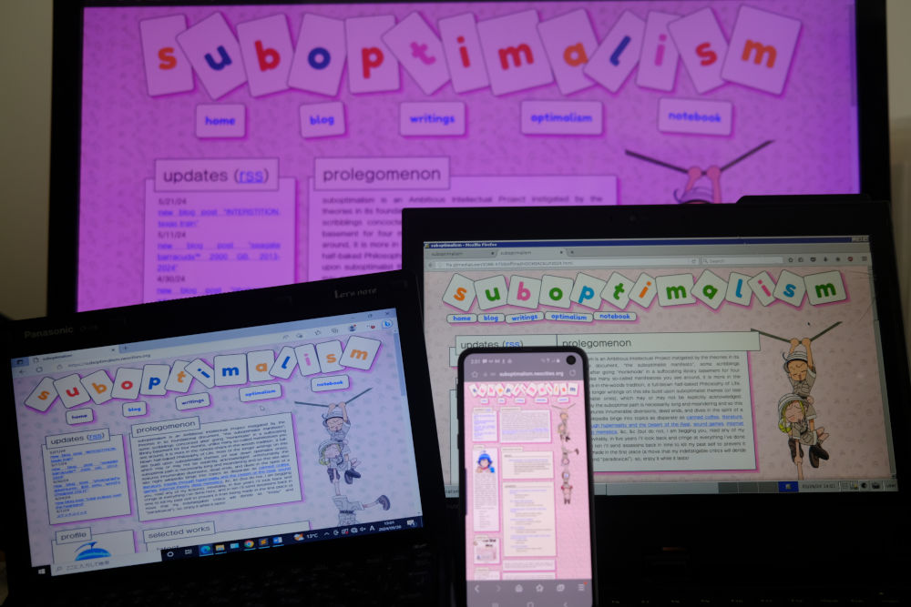
you can also enjoy the responsive layout in this little iframe:feel free to click around, it all worksmy secret? unlike many neocities sites, i define almost every possible length using relative units (%, rem, vw, etc.) instead of px, so the sizes scale to adapt to any screen size. to get the best-looking relative sizes, i use a highly sophisticated iterative process (guess and check). unfortunately it makes everything look tiny on phones, but at least it’s legible if you zoom in, which is better than many sites do.
i did at one point implement a very lazy “responsive” layout that will stack columns, but apparently phone screens have gotten so wide these days that all the old advice that says to use a screen-width-less-than-768px media query to detect mobile devices no longer works, so when i went to test it on my phone it just displayed the good old tiny scaled version. thus, the only way to enjoy the responsive layout is on the computer, by making the browser window really thin. maybe it works in the DSi browser, too.
graphic design is not my passion, it is my struggle
here are some original design documents i retrieved and scanned from the archives (the space behind my computer monitor):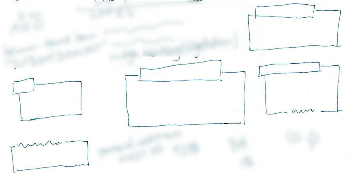 heading concepts, on the back of the receipt for a driver's license renewal. blurred a bunch of unrelated personal notes i scribbled around it
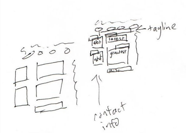 home page layout, sketched on the back of an envelope
current blog page layout, which i'm quite proud of. it came to me in the middle of breakfast and i ran to my desk to scrawl this notei'm not really sure how to describe the style of this site, i've never seen anything quite like it. it's certainly not retro but neither is it very modern, it's got too much going on to be called minimalist but it's not laden with tons of graphics and design flourishes like some sites. i'm not brave enough to let my site look bad so i do put effort into the design, however i have that common amateur's problem where my taste far exceeds my current ability to execute. as a result, it frequently takes me hours of frustration and false starts to put together something i find even minimally acceptable.
mostly the site's graphic design has proceeded in fits and starts, pushed forward by intermittent moments of sudden inspiration similar to prophetic visions. i spent hours selecting the original font i used for the site, but it never felt quite right to me. then one day, i started watching an anime and it struck me at once that the subtitle font was EXACTLY the font i had been looking for, so i immediately broke out mkvtoolnix, extracted the font, and added it to the site, where it remains to this day. other times, when i'm stuck on some design element, i'll cobble together something from stuff that's close at hand. when i needed some additional accent colors for the site's color scheme, i lifted them from the page for a bemani event that happened to be going on around the same time. the offset headings i use (the offset represents suboptimalism), meanwhile, were inspired by something i saw in a random arawi keiichi tweet.
if i had to identify my site design's biggest weakness, it would probably be the dissonance between content and aesthetics. it's not difficult to do, sites tend to be harmonious more often than not - edgy doomer sites with depressing dark color schemes, minimalists with simple restrained designs, lolita sites with frilly flourishes. the best sites, i've noticed, have every aspect work together to form a satisfying gestalt, a form of gesamtkunstwerk.
i suppose the main problem is that my site is so unfocused and contains such a wide range of material that it could easily be four or five different sites. there simply may not be any way to aesthetically unify it into a single whole. believe it or not this is even with me holding back from holding forth on certain topics (business/finance, education, akiyuki shinbo, &c). i already have more than one site, too. "i contain multitudes", indeed. but really, the fundamental issue that makes it unfixable is that the dissonance is on purpose, there's something about deceptive appearances that i find endlessly fascinating and amusing, and i just can't help myself.
data usage
i remember being quite worried about the data cap when starting out, it was always right there in bold on the editing dashboard keeping me in check. i quickly learned, though, that the size of the typical handcrafted html file is negligible and pretty much the only thing that makes it go up is adding imageswhile on the topic of images: i'm sure at some point a blind viewer of my site will complain that i never have any image alt text. i'm sorry, but if i could have suitably expressed the contents of an image as text, i would not have included an image in the first place. may i direct you instead to the 90% of my site that consists solely of text within p tags?. the number of images i use has steadily crept up over time and i host all of them locally, but i've managed to keep space usage down by being fastidious about compressing them. the total site size currently is 108 MB, which means at the current rate the free plan should last me another 18 years, by which point perhaps storage will have gotten cheap enough that the free plan gets bumped up to 10gb per site. the largest single file on the site is probably the default font (5.28 MB), which has been a bit of a thorn in my side because it loads so slowly (if at all) on poor connections. the DSi browser will probably have difficulty loading it as well because the cache size isn't very large. the reason it's so big is that it's one of those maximalist asian fonts which includes about a million "CJK Ideographs", chinese characters basically, a good portion of which probably have only one recorded use in history, scratched into a bone two thousand years ago by a monk, meaning unknown. i really did try to do something about it once by downloading some kind of font editor program to excise the majority of the excess glyphs, but was ultimately defeated.